
How state diagram can help designers?
State diagram (or state-transition diagram or state model) sounds like an engineering buzzword from the 80s, however this is a very powerful tool UX/UI designers could use in their projects. In a UX/UI design project, where UX is focusing on the journey, UI is actually focusing on states and state-transitions. A state diagram is quite flexible, you can make it fit your needs. Bonus: developers can understand it easily. Let’s see what it is and how you can use it.
What is a state diagram?
A state diagram is a representation tool “used to describe and analyze the different possible states of an entity within a system” (Business analyst body of knowledge, v3, 2015). An entity can be any object within a system, depending on what system you are designing or analyzing. In a design system the entity is already very well defined: it is called a component, e.g. a color, a button, a header, a table, a page.
A state is also a known definition in UI design: e.g., a button can have a pressed state and a default state. Not all components have different states, typically a primary color does not have states, but the components which use this primary color might have. Those entities can have states which “do” something either by themselves or as a result of a user action. The basket in a webshop can be empty or not empty, a field on a form can be active or inactive, etc. More complex components can also have states: a search result list can be empty and in this state it might behave differently compared to the state when there are results in the list.
A component which can have multiple states might go through these states in a predefined sequence, and in most cases going from one state to another state follows some rules. Eg. in a webshop the empty basket cannot have the state “paid”, first it needs to contain something. An inactive button cannot have pressed state, first it needs to be active. So when there are several states of a component, not all transitions (going from one state to another) are valid.
In a state diagram we use boxes to represent states and arrows to represent valid state transitions. State diagrams are kind of complementary methods of the activity diagrams: on activity diagram the boxes represent activities (transitions) and the arrows show the states.
Let’s see an example. We were doing the design in a document management system implementation project for a pharma company. In this system the document could have the following states:
Edit: from the point the user created the document they can edit it. Until the point the owner of the document sends it for approval, we consider it as under editing.
Waiting for approval: In this state the document cannot be edited and it is at the managers who can either approve or reject it. Once it is approved, it moves to approved phase. Once it is rejected, it goes back to editing.
Approved, waiting for signature: When all approvers approved the document, it goes for another managerial level to be signed. Signers can still reject it, then it goes back to editing. Or all signatures are collected, then it moves to signed state.
Signed: All signers gave their signature, the document can be distributed in-house or sent back to the vendor, depending on the nature of the document. It cannot be edited any more, it is a “final” version.
Invalid: It might happen that a new version of the same document gets all the signatures (eg. imagine an internal holiday policy), the previous version of the document will be invalid.
Let’s see how these steps look on a state diagram:
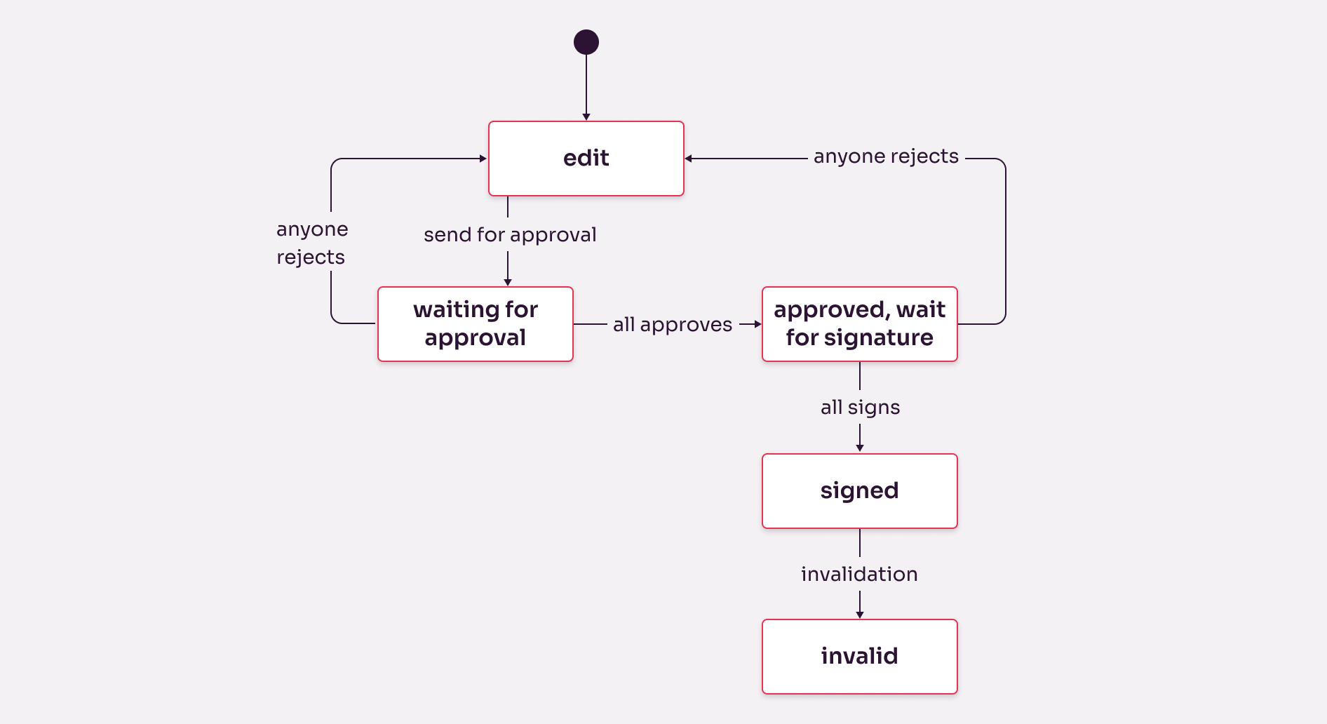
A state diagram showing an example from a document management system
How can we use a state diagram?
Any representation methods are just recommendations. We can adjust them to our needs. No teacher stands behind you to check how precisely you are using a state diagram. Business analysts love standardizing their tools, but simply because there is a formal spelling book of your language does not mean you cannot say what and how you want. I’ll show what I mean.
The state diagram in the above format might look handy at first, but it is difficult to add other information to it. So first lets make it one-dimensional, lets flatten it. It means that the states will be in one row — it might result in too many arrows around them, but we pay this price.

State diagram with the same content as above, but this version is “flattened”
Now we can add another dimension to our diagram, so it will become a matrix. I’d recommend adding the components in the other dimension, in this way we can show how each component looks like in each states. You can simply add a description, or you can add the graphical versions to the matrix, it depends what is easier to understand and to create. I’d recommend to put only those components on this matrix, that are changing according to the states, and do not put all the components to the matrix to avoid it to be too big and unusable.
Also we can add functionalities in the other dimensions, and show which user group have rights to access the functionalities in each states.
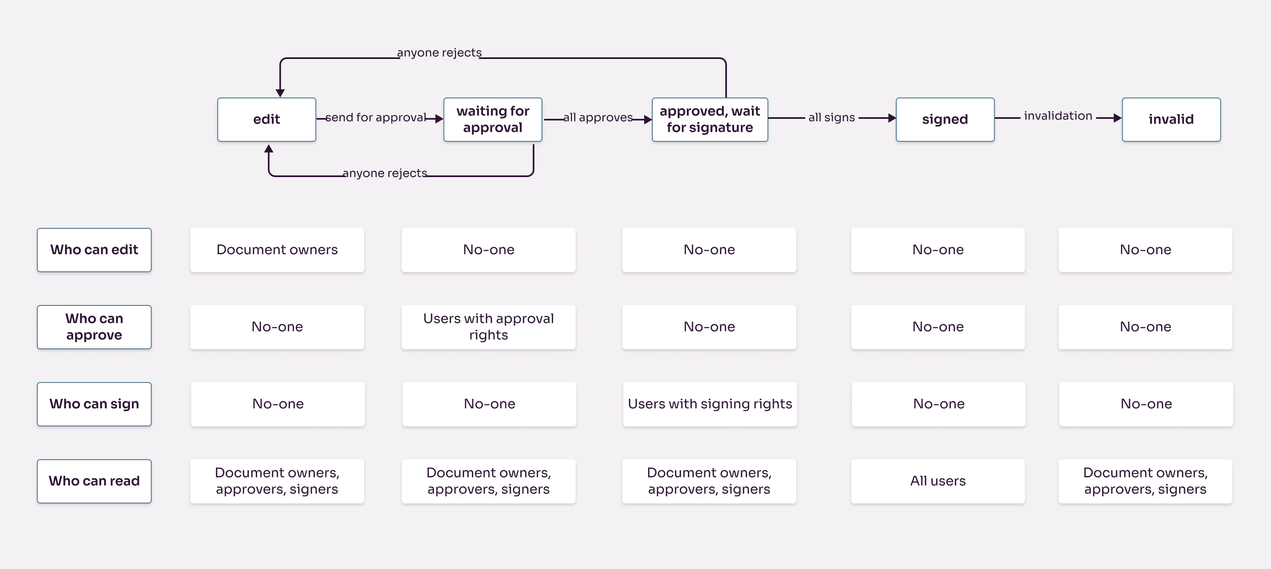
State diagram with an additional dimension showing user rigths in each state
This way we get a user rights matrix, and developers will be extremely happy. Another benefit of this user rights vs. state matrix is that there is no gap, since the matrix contains all functions and all states (and we filled all cells of the matrix), there can be no special case we did not think about.
The good news is that the two previous matrices can also be combined: the states, the main components and the privileges can all be put on one matrix.
How state diagram helps design?
I believe state diagrams are natural tools of UI design process. In UX we focus on the customer journey, which is an activity-oriented approach. From the point we need to design the final screens, we need to change our mindset to a state-oriented approach, to build up the UI components and to define how each screens need to behave. People are doing processes, screens have states. When we already have the journeys and screen-flows defined, we need to distill the states of these components. In some cases these states are trivial (active vs inactive state of a button), but in case of more complex components or more complex processes, these states are far from being trivial. So you need a good tool to collect, describe and represent these states: this is state diagram.
A state diagram is also a quality control tool: once you identified all possible states of the main components, you will see if you have thought of all states of the smaller components. A state diagram in this approach is a double-check tool, a frame which need to be filled out.
State diagram also helps in the communication with the developers, as they tend to try to find the gaps in your process-oriented design. Once you have defined all the states and all components are defined in each state: there is no gap, and the developer is happy, which is half the success.